INVENTORY TRACKING SYSTEM: DEVELOPING A BETTER INTERNAL TOOL
Overview
At Kineta, thousands of business-critical frozen samples were being logged in a large Word document (over 45 pages) that lacked an easy or controlled way to add, search, or remove samples.
Based on insights from user research, I designed and built a dynamic and flexible inventory tracking system that significantly improved the user experience, while greatly reducing impact on temperature-sensitive materials.
Methods
User Research (Contextual Inquiry, Photo Survey, Stakeholder Interviews, Flow Analysis), Personas, Sketching, User Flow, Wireframing, Prototyping, Usability Testing, Development)
research
While working at Kineta, one issue that constantly came up was scientific staff being frustrated with the large Word document (over 45 pages) that was used to crudely keep track of frozen inventory. I took a comprehensive look at the current system through a variety of user methods, and was able to put together a list of design requirements for a more searchable, flexible, and scalable system.
Contextual Inquiry with Photo Survey, Interviews
I observed and spoke with 4 research associates as they used the current Word doc (shown below), as well as their process of physically interacting with the freezer itself. Photos were taken during the study, in order to inform the notes, and some samples can be found below.
I also interviewed 3 research managers, who didn't interact directly with the freezer and samples directly, but who I identified as key stakeholders with insights into business needs.
Original inventory system -- A 45+ page Word document
Kineta Cold Storage Freezer | 6 racks with 10 boxes each (up to 6000 samples)
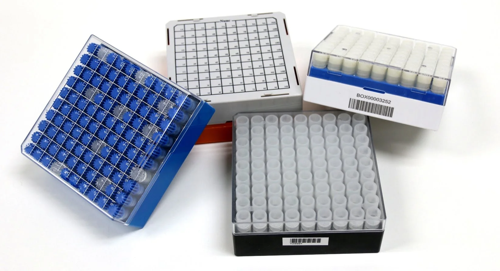
Sample Cryoboxes stored in the freezer racks | Image Credit
Taken together:
In addition to the limited search functionality, there were also regular complaints about the accuracy of the inventory document, and generally not knowing how much free space was available in the freezer, which was shared across multiple teams.
Flow Analysis
With data from the contextual
Since the document incorporated screen captures instead of text boxes, the user flow was an efficient way to start gathering and prepping images ultimately required to build the slide deck that followed the sessions.
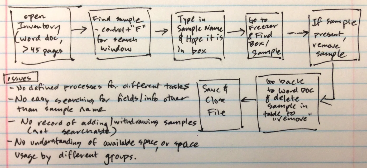
User Flow | Current Process for finding and removing a sample from inventory.
Flow Analysis
§ Methods: Evaluated workflow and user experience through ethnographic research and contextual inquiry (included interviews, shadowing, photo survey, Try it Yourself, flow & error analyses, prototyping)
§ Solution: Based on user research, created a dynamic Excel/VBA-based inventory utilizing visual management and interactive design to significantly improve user experience
§ Streamlined previously disjointed process into clarified user tasks (Browse, Add, Withdraw, Move)
§ Added rapid searching of sample names as well as new user-defined fields
§ Incorporated controlled and standardized sample entry, movement, and withdrawal history
§ Provided visual understanding of space usage and availability for future samples
§ Created a comprehensive user manual & provided training to staff
§ Excel Inventory (link)
User Research (Contextual Inquiry, Photo Survey, Stakeholder Interviews, Flow Analysis), Personas, Sketching, User Flow, Sketching, Wireframing, Prototyping, Usability Testing, Development)
the tool was a way to make things easier to search than word doc, but it became more than that after user research. Evaluate space, know what was removed (log) and what was remaining (so don't run out), be able to search for more than just the name of a sample (because there could be different versions of the same thing.
The heuristic analysis was a useful reference for highlighting potential user pitfalls during usability study planning.
usability testing
After meeting with our Microsoft stakeholder, we put together an initial study plan that covered the purpose/scope, research questions, participant characteristics, methods, task lists, testing logistics, facilitation approach, and approach for data collection and evaluation. After subsequent meetings, we were able to refine the contents further to meet the needs of our client.

Study Plan, pages 1 & 2 of 7
Usability Test Kit
Following client approval of the study plan, we started work on our Usability Test Kit, including the screener, consent form, facilitation scripts, tasks and scenarios, questions, and forms for data-logging and note-taking. We also coordinated meetings with our client to become familiar with the setup of the Microsoft usability lab, and to run a pilot session.
Screener
Based on the participant characteristics outlined in the final study plan, we put together a screener that would be used to recruit the 10 participants for the usability study. The first page (not shown) included a list of requested participant characteristics to help clarify our requirements during the recruiting effort (recruiting for this study was handled internally by Microsoft staff).
Microsoft was looking for participants between the ages of 18-50 (evenly distributed) who worked at large companies (>300 employees), with a mixed Android experience ranging from novice to expert, and who were not currently using the Skype for Business Android platform.

Screener, Page 2 of 3 (Script)
Final breakdown of participant profile
Method and Structure
The pilot session and ten 90-minute participant sessions were conducted in a Microsoft usability lab, where the moderating (during scenarios and tasks) and note-taking took place behind a one-way mirror. Video of the participant's face and the Android screen were monitored and recorded.
Each session opened with a face-to-face introduction and some open-ended questions to understand the participant's workplace and how communication tools were used. Participants were provided with a paper participant guide as they proceeded with 10 related scenarios that each contained multiple tasks (one scenario per page).
In addition to success scores, participants provided experience ratings (satisfaction level, 5-pt Likert scoring) and qualitative feedback for each task prior to moving on to the next scenario. Participants finished the session with a post-test questionnaire and additional summary feedback.
Capturing participant feedback immediately after each scenario gave us the opportunity to get real "gut-feeling" task scores and comments when the experience was still fresh in the user's mind.
High-level structure of each usability session
Sample scenario from participant guide, provided to users for referencing tasks and Likert scoring
A unique challenge of this study was having participants communicate with "colleagues" during the various scenarios–played by us as researchers–that touched on the various functions of the app. This approach required us to have real-time conversations with the participants via IM, voice calls, and video calls, while also moderating and taking notes.
Putting the participants in real-time improvised scenarios increased their distraction level and created a cognitive load that they might face in real work experiences. Importantly, we found that app functionality and feature discoverability was impacted in these situations, particularly when video was being used.
Data Analysis & Reporting
Analysis
I created a note and scorekeeping spreadsheet in Excel that reduced cognitive load for the researcher during usability sessions that required real-time texting with participants. The tool also increased the speed of data analysis and synthesis by grouping observations, quotes, and scoring by the specific scenarios and tasks. Scoring was also averaged as soon as the data was inputed, which provided immediate feedback to the team.
Separate tabs in the Excel Spreadsheet were created for pre- and post-session questions and related note-taking, specific task scoring and notes, additional notes originally collected in Ovo software, and automated data analysis and graphing.
Excel Sheet (partial screenshot)
As part of the data analysis, an executive scorecard was calculated and put together to quickly highlight overall top-two scores for the task satisfaction ratings, and how the scores compared to a previous version of the app. Top-two box refers to the percentage of participants who gave a satisfaction score of 4 or 5, on the 5-pt Likert scale.
Top-Two Box Scores for Task Satisfaction Rating (% of 4 or 5 scoring on 5-pt scale). Labels removed for confidentiality reasons.
Synthesized findings across the various app functions were given severity ratings similar to Jeff Sauro of MeasuringU, which helped the Skype team prioritize design fixes from a large usability study. Participant quotes relevant to the findings were also pulled to add empathy to the research story, along with a video snippet (edited in iMovie) for the most impactful finding from each app function.

Reporting
Although the study required a large in-depth research report (>100 slides) per Microsoft's request, we front-loaded the deck with an overview that covered the study approach and methods, a profile of the study participants, and an Executive Summary featuring the task scorecard.
The upfront structure of the final research report enabled stakeholders to get a quick high-level view of the results, without having to fully digest the Detailed Findings section, which was the bulk of the deck and covered the tasks from all 4 app functions (IM, voice calls, video calls, and meetings).

Within the detailed findings portion of the deck, each individual scenario had a title page slide that included the full scenario along with the various tasks within that scenario, in order to orient the stakeholder by setting up the next few slides. The tasks within the scenarios each had:
- a golden path slide showing screen shots of the steps to accomplish the task
- a ratings slide showing a breakdown of the satisfaction scores and how they compared to the previous version of the app, along with a relevant participant quote
- a findings slide that highlighted the key takeaways, along with severity when relevant, and researcher recommendations
Here are some representative slides for the detailed findings portion of the deck. Specifically, they cover the task of "Know who is in the meeting (and who hasn't joined yet)" from a scenario within the Meetings section of the study:

Example of a Scenario Title slide

Example of a Task Golden Path slide

Example of a Ratings slide (Data removed for confidentiality reasons)

Example of a Findings slide
Summary
The Skype for Business project provided me with great insight into Microsoft's approach to usability testing and user research in general. Although it originated within an academic setting, the project was the sole usability study for that version of the Skype app and therefore had real business implications to the Skype team. The client was very impressed with the rigor of our work, including the additional data analysis spreadsheet that I put together for the study, and invited us to present our findings to the team (the deck described above). While this presentation request was outside the original scope of the academic project, it was a reflection of our success and a great opportunity.